
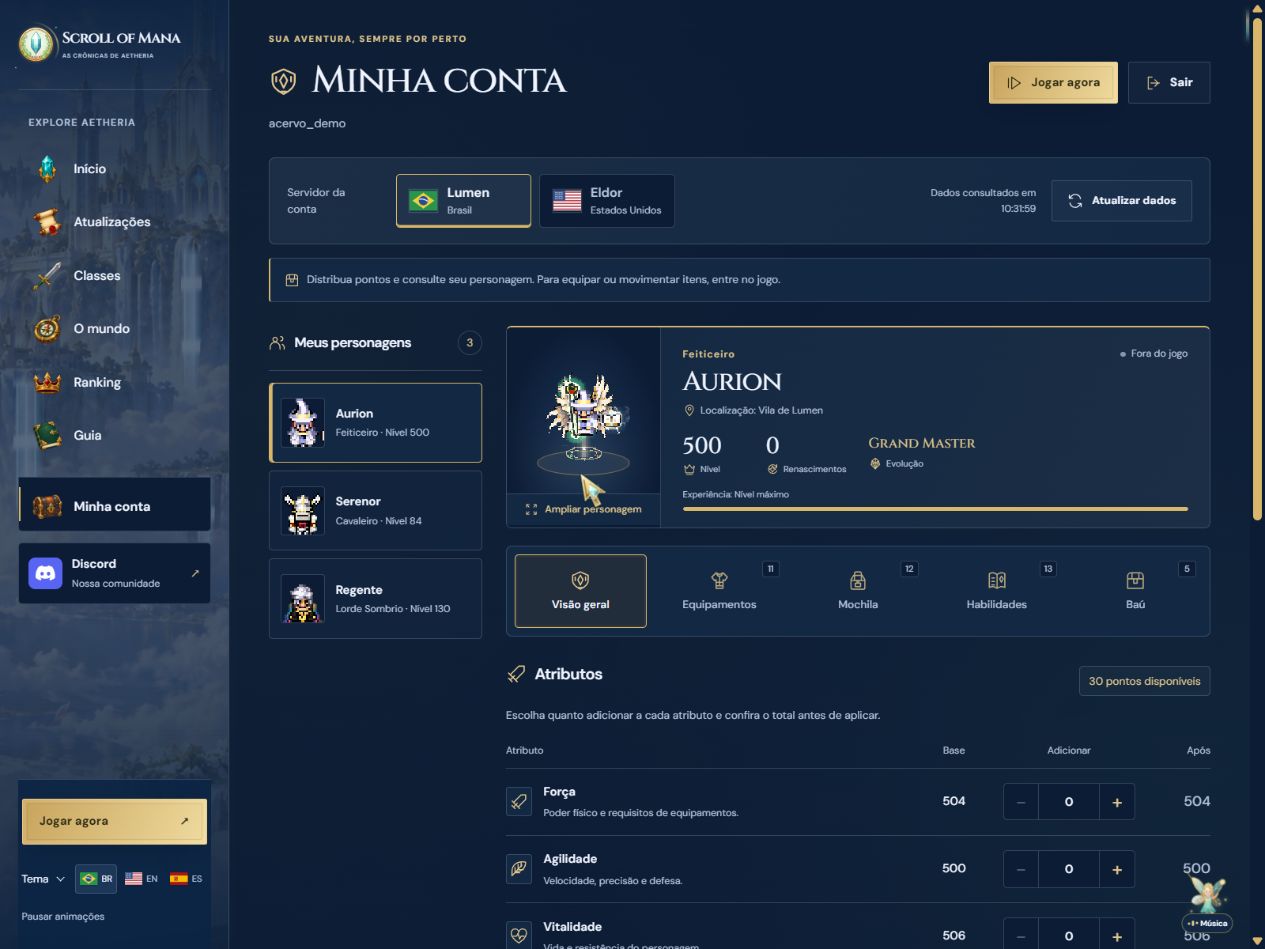
A clearer account panel with icons and organized collections
Open My account from the website menu to find icons in tabs, attributes and main actions. Realm choices now show their flags, while level, rebirth, evolution and location indicators have their own symbols. On mobile, the five tabs use two rows to keep their full names readable.
Equipment follows the order of the character's slots, with labels for weapon, off hand, armor, accessories and wings or cape. In Inventory and Vault, use search and the equipment, consumable, companion and material filters according to the available items. Search finds names without requiring accents, shows the number of results and offers a clear button. Escape also clears search and filters. Select an item to inspect its image, stats and requirements.
Attributes now have icons and a more compact presentation when no points are available. When points are available, the panel retains allocation controls and the total review before applying. Accounts without characters receive guidance on getting started. In username and password sign-in, the eye button shows or hides what you typed.
The finishing touches also reach Updates filters and card dates, the homepage's first steps, world indicators and footer links. White, green and blue color choices remain available. The collapsed music control takes up less space over the account sheet. Images show the actual interface in a local demonstration with fictional characters.
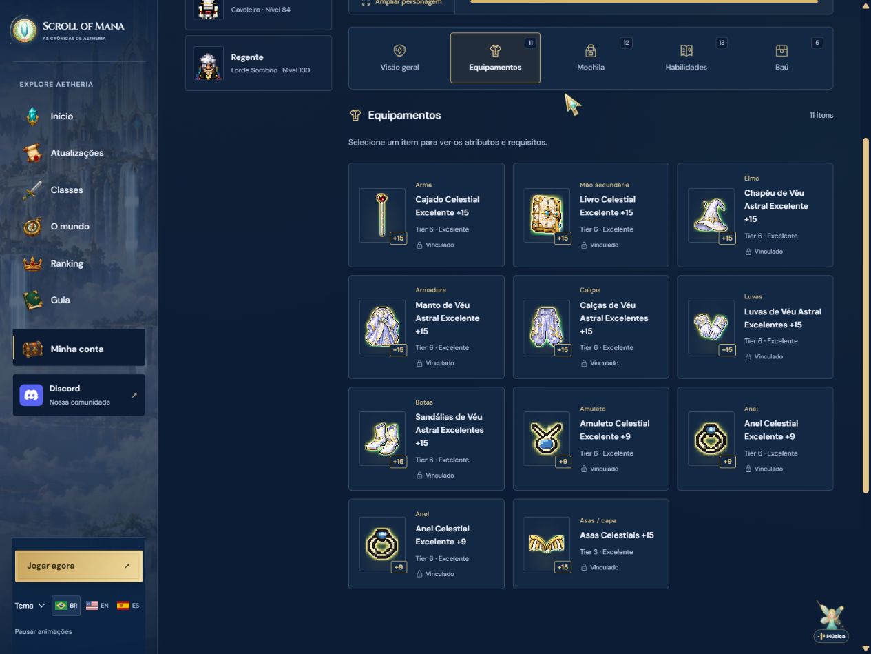
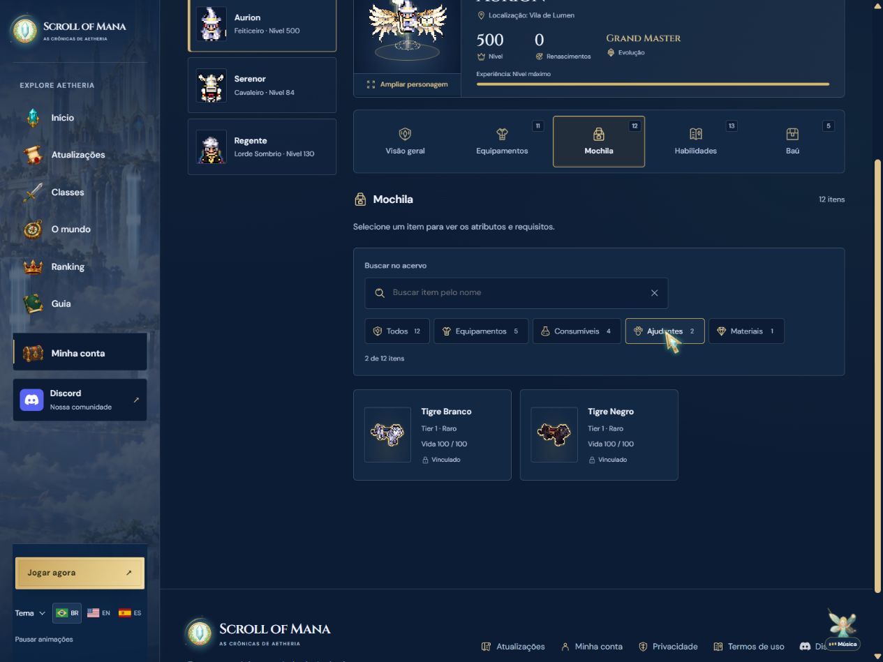
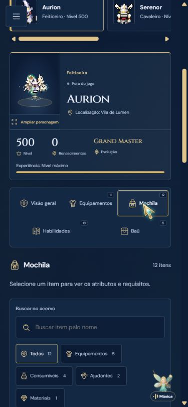
What changed
- Icons in all five account tabs, attributes, indicators and main actions.
- Realm flags and full mobile tab names.
- Equipment sorted and labeled by slot.
- Accent-insensitive search, type filters, result counts and clearing in inventory and vault.
- Compact sheets for characters without points and guidance for accounts without heroes.
- Show or hide password buttons on account sign-in.
- Icons in update filters, card dates, first steps, world indicators and footer links.